Project Overview
As part of my Diploma in UX Design from the UX Design Institute I was required to a carry out a case study and design a website prototype for a fictitious airline called Fly UX. Fly UX is a start up airline and they are looking to create an online booking experience that is fast, intuitive and easy. Using great design to give their product a competitive advantage.
Goal
My task was to gain a deep understanding of my target users and create interactive website prototypes, along with a detailed set of wireframes. With a specific focus on the booking process: how users search for, find and select their flights.
Process
For this project I followed the full UX design process. Before designing the visual layout I followed different methods of research to gain an understanding of the user, specify their requirements and define the problems that they encounter when making a booking.
Typically, after the prototyping, the process would circle back to design and prototyping based on usability testing and continue this cycle until the final version is perfected and only then can the wire framing begin. However, for this project the structure remains linear.

Research
Benchmarking
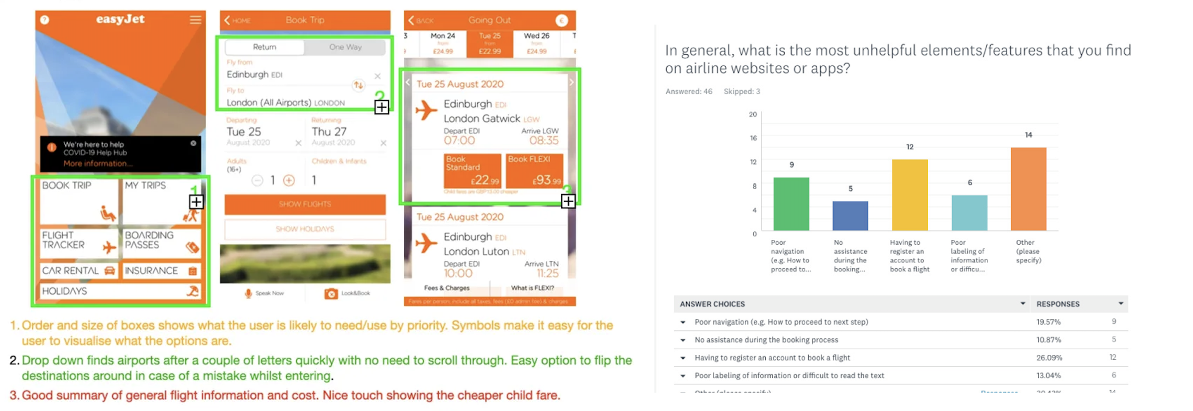
An analysis of the booking systems of rival airlines was made to identify best practices, conventions in the industry, what aspects to be emulated and approaches to avoid. The websites that stood out to me had a clean and well-spaced layout that made scanning the information on the page easy and minimised the number of steps in the booking process.
In short, those websites that focused on making flight bookings simple rather than trying to upsell to customers gave a better user experience.
User Research
To obtain a better understanding of users, I conducted an online survey and user interviews. Key findings from online survey (49 responses):
Which device did you use to make your booking?
60% laptop / 30% phone / 10% tablet
In general, what is the most unhelpful thing you find on airline websites or apps?
26% Having to register an account to book a flight
19% Poor navigation
13% Poor labelling of information
10% No assistance during the booking process
Usability Interviews and Tests
Four user interviews were conducted and observations of the users making a booking on rivals’ websites revealed some interesting insights:
- The reasons for some users getting stuck in the booking process was because of the poor designs of navigation or input controls – they did not look ‘clickable’.
- The display of information was not always coherent. Users were sometimes confused on the pricing for the items that they had selected. Is the price for the outbound and inbound flight? Is the price displayed for one or two passengers?
Analysis
Affinity Diagram
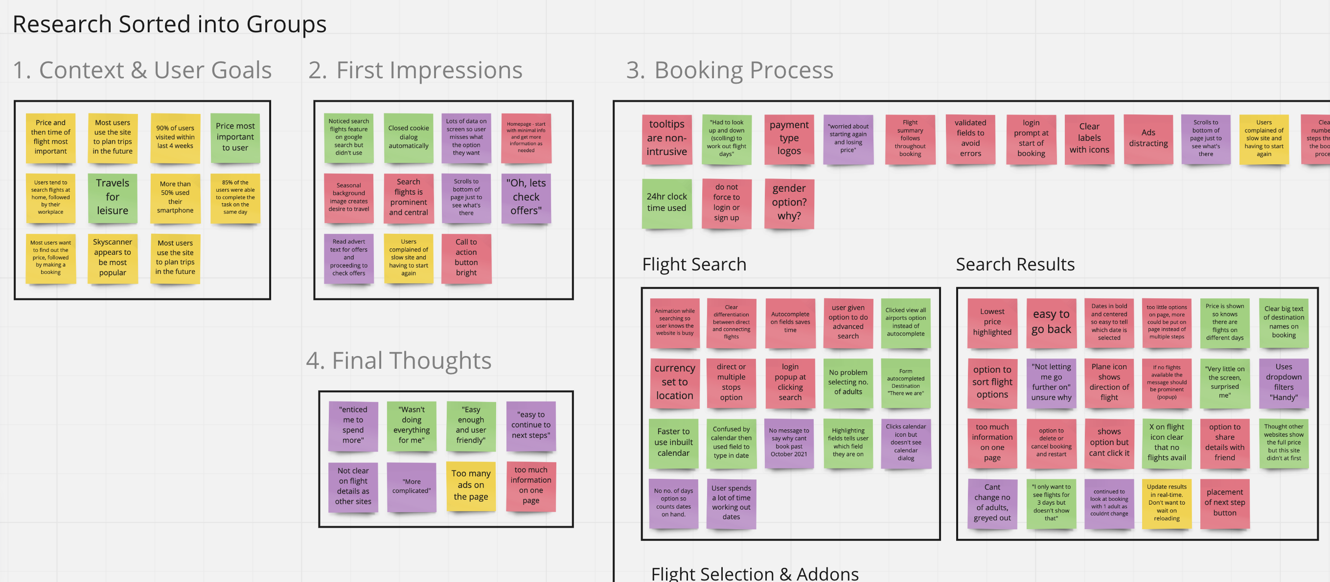
To start making sense of all the different data I had collected I recruited a partner to read through the research and write out observations on post it notes. We started to arrange the post it’s into categories to create an affinity diagram. From there I came up with group/sub group names for them and organised them into a priority order.
It was clear from creating and analysing the groups that most user negative points where around calendar, price and the extra/add on steps.
Customer Journey Map
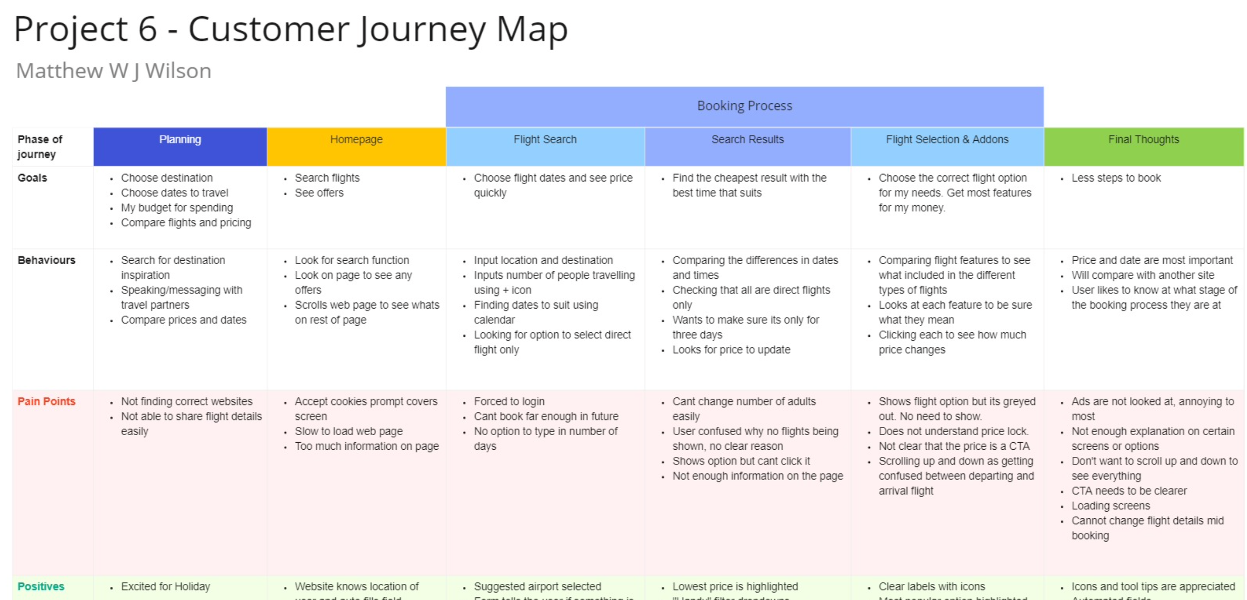
I organised the information from my affinity diagram and created a 10 step by step view of the journey to demonstrate how the user felt before starting the task and then at each stage of the booking process. I added notes of the users goals, mental models, behaviours and pain points. Finally user quotes were added for more context when referring back to the CJM.
This tool clearly highlighted that the biggest pain point in the customer journey is around the add ons/luggage step, making it a focus point for my designs.
Design
Flow Diagram
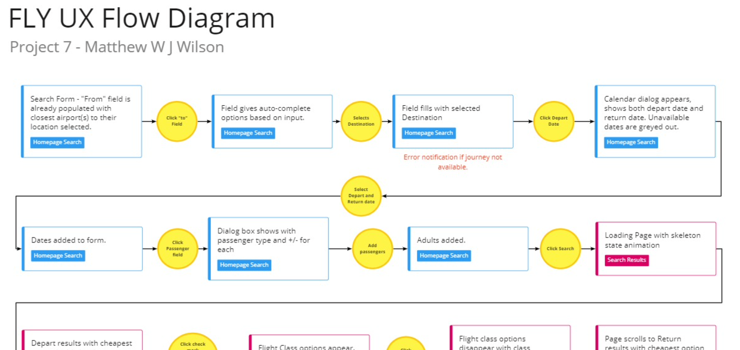
The design phase began within defining the flow. I used the findings made in my research and analysis to define a high level flow for a single use case. I began the process by making several sketches of the flow which allowed me to quickly translate my ideas and thoughts to paper.
With every sketch I was able to refine and address the issues that where uncovered in my research. Once happy I recreated the flow digitally, fine tuning the small details.
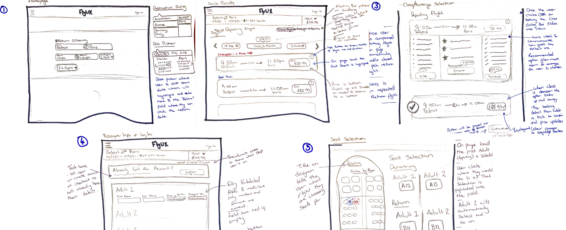
Interaction Design & Sketches
Preliminary low-fidelity screen designs were quickly sketched. They were further refined and added to the user flow diagram to help visualise the interactions as the user moves through the booking system.
Prototyping
High fidelity
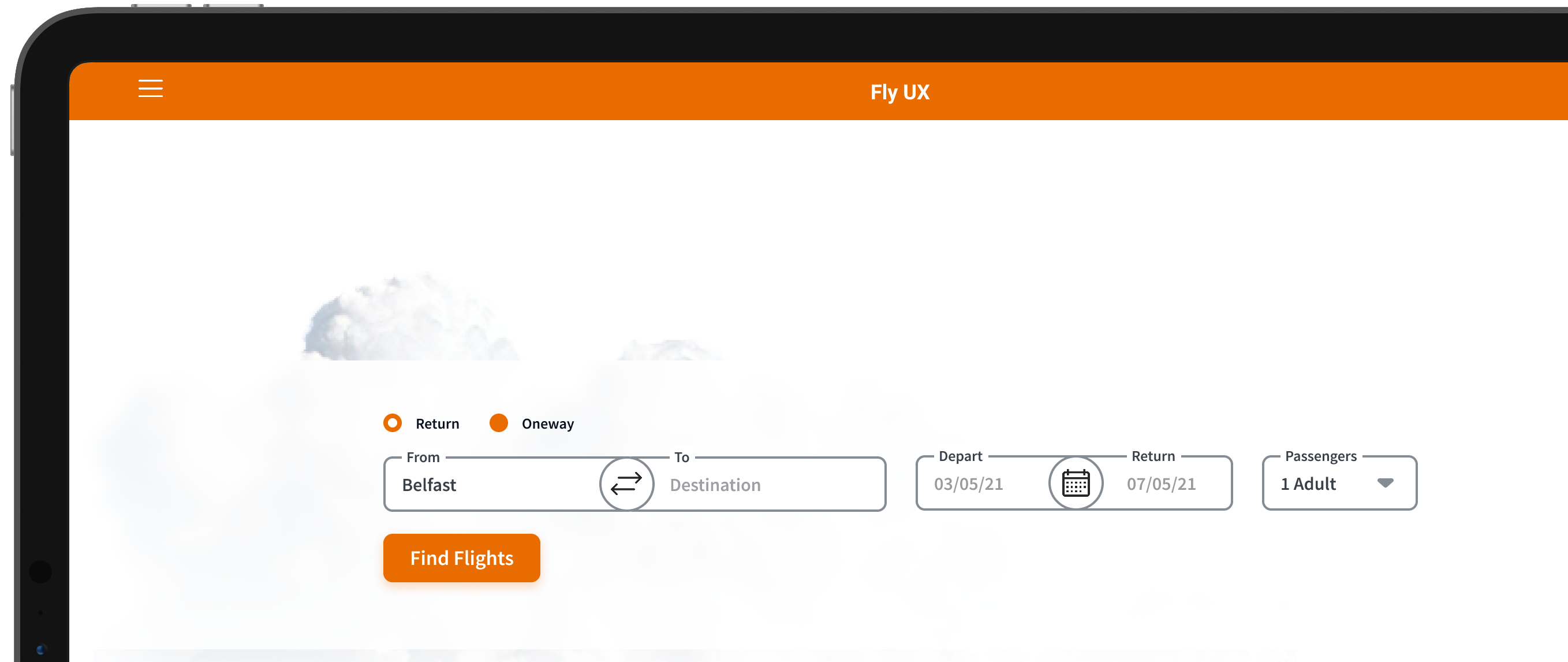
After defining much of the solution through my flow diagram and sketching I created an interactive website prototype. The prototype was built with all of the necessary detail and interactions to test the high level flow, screen layouts, text and interactions.
The process was relatively straight forward as I had defined each screen states in detail during the previous exercise.
Wireframing
Handover
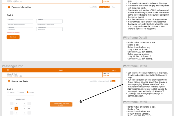
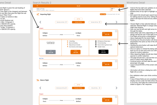
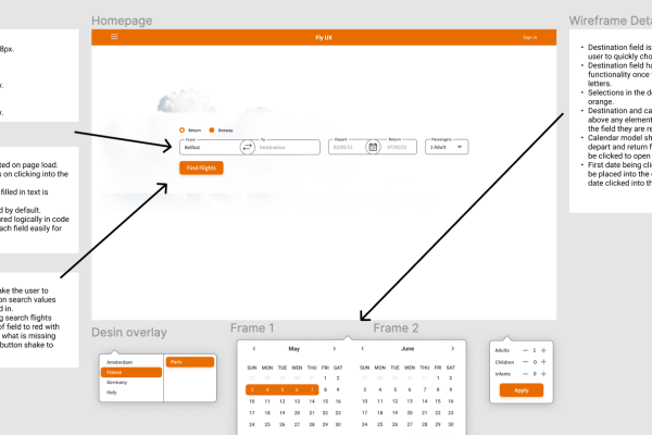
The final piece in the puzzle after all the research, analysis, design and prototyping was to prepare the document to hand over to the development team. Close attention to detail and labelling was crucial to ensure a smooth hand over to the development team, so they do not need to guess or fill any blanks. I added a layer to my Figma prototype to create my wireframes then moved them over to a powerpoint for the handover document.
Conclusion
What I learned
I enjoyed following the UX process, solving problems and building empathy with the user to fully understand their wants and needs. I was able to develop a UX toolkit for future UX projects and adopt a user first mindset to create a digital product with a positive experience.
The whole project was a huge learning experience, if I could start it again I would conduct more research. Specifically I would conduct more usability tests, the insights I gained were vast and they gave me the confidence that I was solving real user issues.


